OM - CM
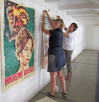
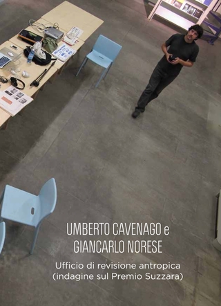
The inventors of this logo, the artists Umberto Cavenago and Giancarlo Norese, after having studied our history in all its aspects, perform an operation that I would define as detournement: distraction and decontextualisation on something that we are used to seeing according to a certain form that is familiar to us, the OM trademark precisely. Another horizon of meaning opens up, evoking the first but displacing it elsewhere: "CM", or CASAMATTA, a fortified outpost with tasks of observation, defence and design.
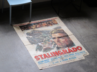
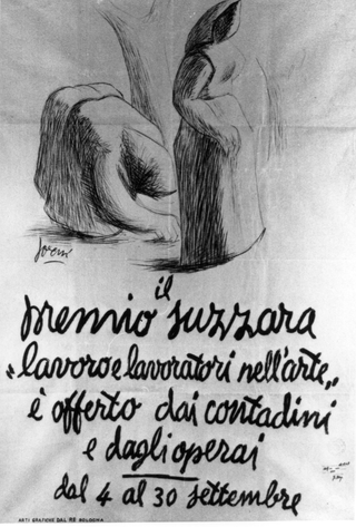
CASAMATTA, paraphrasing a phrase by Debord in 1956, designs situations made to be experienced by its builders, who are the people of Suzanne with their history, i.e. nothing could be further from the 'public' of spectators, to whom every emotional reaction is extorted from the outside and the outsider. The "CM" logo, evocative, phantasmal, dialectical, critical, "subversive" in its expropriation, but also immediate, recalls that character of "simplicity" that Dino Villani, as an advertising theorist, invoked in the design of trademarks and that he put into action in the invention of the Suzzara Award, back in 1948 and that John Maeda in his 2006 book "The Laws of Simplicity" defines as follows: "Simplicity means subtracting the obvious and adding the significant". The 'O' subtracted through graphic tampering is transformed into 'C' without changing the original (typographic) character. We are not faced with an archaic, regressive, nostalgic image that takes refuge in a mythical past, but with an image that is the dawning of the new and the production of the original: this is where its originality lies.
"Which means locating the dialectical image as the place par excellence, where what really concerns us could be thought of in what we see" (Didi-Huberman).
Marco Panizza, 2012


Social
Contatti
umberto@cavenago.info